 [Thirty-five years ago, in November 1982, I published the following essay in Lens’ On Campus, a magazine directed at high-school and college-level teachers and students of photography, produced in an edition of 100,000 copies and distributed in bulk, free of charge, to such programs six times a year. At the time it was one of the few regular platforms available to me.
Part 2 appears below; click here for part 1. — A. D. C.]
•
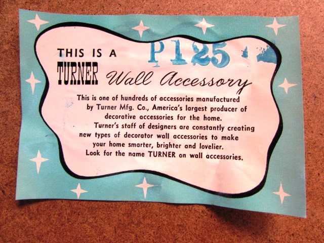
The Origins of the Wall Accessory (cont’d)
… A person in my line of work necessarily comes into contact with a considerable amount of what we generically label “art,” and a fair cross-section of what’s known as “art photography.” At the outset this is tremendously exciting, because everything you come across is the first of its kind to you, and you couldn’t agree more with those people who tell you what a terrific job you have just looking at pictures all day.
At the next stage, patterns and tendencies start to become visible, quality levels are more clearly defined, and you are forced to the conclusion that — as in any field where intellect and creativity play a major role — at least eighty percent of the work you’re addressing, no matter how well-crafted and seriously intended, is technically mediocre and (to use gallery owner Lee Witkin’s phrase) intensely derivative. With this discovery the mystique dissipates, revealing that the job at hand is just that — a job — and one roughly analogous to that of the bottle-checkers on “Laverne and Shirley,” except that their task is to filter out and discard the untypical and yours is to analyze and evaluate it. [Note: November 27, 2017: This bit of cultural history may require a gloss. The sitcom “Laverne and Shirley,” starring Penny Marshall and Cindy Williams, ran on ABC-TV 1976-83.]
A certain disillusionment sets in at that point. For some, it generates an embittered relation to the field, enough so in many cases to drive them from it. Others accept it cynically and decide to revel in the power prerogatives of those involved in “stoking the star-maker machinery behind the art photograph” (a slight paraphrase of Joni Mitchell). And a few, who continue to believe that there is something important and useful to be derived from the enterprise nonetheless, buckle in for the long haul.
The idiosyncrasies of personal response notwithstanding, though, the underlying assumption here is that we’re talking about discriminating between various manifestations of the same thing, namely what we loosely label creative/serious/art photography. We may determine that specific examples or even large masses thereof are (depending on our vocabulary) good/bad, successful/failed, extraordinary/mediocre, but we take for granted that they share certain intentions: intellectual and/or emotional expression, perceptual inquiry, technical experiment, and several others on which we might agree.
But in the past few years I’ve witnessed the startlingly rapid emergence of a class of objects which has insinuated itself into and infected every arena of creative photography, from the gallery/museum circuit to the publishing realm. Physically, in themselves and in their presentation, they display many of the characteristics we’ve come to associate with the so-called “art photograph”: careful printing and toning, archival matting, and the like. (As a rule, anything encased in all-rag board and put under glass in a metal frame will look like Art.) Moreover, their subject matter tends to fall within the boundaries of what we associate with the history of visual art: the landscape, the nude, the still life, and so forth.
And there the resemblance ends, for these artifacts are not intended to engage the discourse of art or creativity on any level whatsoever. No meaningful gauge can be applied to them; since they take no risks by which they could be considered failures, it is impossible for them to succeed. Their intention is neither aesthetic nor anaesthetic (a distinction made in our time by such critics as Kenneth Burke and Anthony Burgess: the aesthetic is that which shocks the audience into reconsidering an established reference point, while its opposite, the anaesthetic, is that which soothes, numbs, and corroborates prior assumptions). Indeed, they are not actually meant to be looked at long or attentively, for under contemplative scrutiny their deliberate superficiality and formulaic structure fall apart almost immediately.
This is visual Muzak, specifically intended to occupy spaces which cultural tradition reserves for flat artworks, and carefully designed to serve that purpose without offending the sensibilities of anyone or arresting their attention even momentarily. Their purpose is to harmonize blandly with their environment without asserting any demanding identity of their own. In short, they are PHOTOGRAPHIC WALL ACCESSORIES.
•
Anyone who’s spent time with photography publications and exhibitions over the last five years can confirm the growing population of photographic wall accessories. The third- and fourth-generation imitators of Weston, Strand and Adams produce them by the gross. So do Jay Maisel, Ernst Haas, Gordon Parks and Lucien Clergue, among other old masters of the genre. Most contemporary still-life photography, particularly that done in color, falls into this category — not surprising when you consider that the still life as a form originated as decor for the dining rooms of the Dutch bourgeoisie. Certainly the emergence of a market for “art photography” in the American middle class during the past ten years has played a role in this development.
Yet what disturbs me most about this development is not the appearance of this ersatz form in the commercial venues for art photography, but its increasingly visible presence in the photo-educational system. Much of the photographic wall accessory material now on view and in print is the product of recent graduates of photo schools and departments across the country. More ominous still, the evidence I gather from the schools I visit, the student publications I receive in the mail, and the student portfolios I encounter in workshops, all indicates that more and more photo students are aspiring to the status of photographic wall accessory manufacturers.
 Institutions are by nature oriented toward conformism and the avoidance of controversy, qualities for which academic art in general is notorious. And youth, like old age, tends toward conservativism. For exactly those reasons, though, it’s long been understood that the challenge facing those who teach students in art is one of forcing them to work past the regurgitation of cliches, the imitation of the already established and the reliance on the safe, in order to plunge into deeper waters. It seems to me there is clear evidence here that many of today’s teachers of creative photography are surreptitiously converting that field into an adjunct of interior decoration. That they appear to be meeting little resistance in this effort suggests that many of today’s students of photography are ducking their own responsibilities — which surely include what used to be called tending the fires as well as what Duane Michals punningly describes as “derailing your train of thought.”
Unfortunately, when you get a lot of “genuine imitation” anything mixed in with the real thing, people begin to lose their ability to distinguish between them. The degradation of language usually follows close behind, and one enters the realm of the “wall accessory” — a locution matched only in my experience by that other contemporary classic, virgin polyester.
There’s little any one critic (or even a fluster of same — fluster being the collective plural form) can do under such circumstances except inveigh against the syndrome and excoriate specific examples thereof. Given my own personal predilections, however, the situation does give me something to anticipate with pleasure. Being by definition contentless and insubstantial, photographic wall accessories should prove eminently disposable — which means that I can look forward to salvaging their frames and all-rag backing boards from the dust bins in the not-too-distant future.
•
[Postscript, November 22, 2017: Around the same time as I wrote the above essay, while driving out to Hylan Boulevard, the mercantile strip two miles from my house on Staten Island, in search of office supplies at a Staples store, I came up toward the boulevard along a side street. Facing me as I got close to Hylan stood a billboard advertising a sale, at a local hotel, of “Real Oil Paintings by Live European Artists,” $25 and up. What stopped me in my tracks — or, more accurately, got me to pull my Honda off to the side, park it, get out, and stare — was the billboard’s headline, in 10-foot-tall type: SOFA SIZE PAINTINGS.
I knew immediately that the culture had handed me an epiphany. Just as I’d never encountered the locution “wall accessory” before hauling that frame out of the trash, I’d never before heard or seen the phrase “sofa-size painting.” Yet I knew immediately what it referred to, especially because circa 1982 we had just begun to enter the era of the sofa-size photograph, now so commonplace that no one gives it a second thought, not just in the marketplace for photographs but in the post-secondary fine-art photography environment. The two concepts — which thenceforth became inextricable — instantly burned themselves into my consciousness.
An unsigned New York Times report from December 1, 1981, “A Picture Over the Sofa,” attributes the origins of such sales to one “Richard Gitelman, a 39-year-old resident of Kings Point, L.I., who supplies paintings to sales in the metropolitan area and across the country … [who] does not know who coined the catch phrase ”sofa-sized art,’ which is a 2-by-3-foot painting that is about 44 inches wide when framed and thought to be proportionately correct for display over the standard 72-inch sofa.”
Click here for Jeff Slater’s intriguing analysis of the “sofa-size painting” as a marketing ploy, published on January 13, 2017 at his blog, The Marketing Sage. — A. D. C.]
•
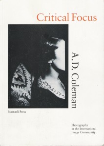 Special offer: If you want me to either continue pursuing a particular subject or give you a break and (for one post) write on a topic — my choice — other than the current main story, make a donation of $50 via the PayPal widget below, indicating your preference in a note accompanying your donation. I’ll credit you as that new post’s sponsor, and link to a website of your choosing. Include a note with your snail-mail address (or email it to me separately) for a free signed copy of my 1995 book Critical Focus!
 But wait! There’s more! Donate now and I’ll include a copy of The Silent Strength of Liu Xia, the catalog of the 2012-13 touring exhibition of photos by the dissident Chinese photographer, artist, and poet, currently in her sixth year of extralegal house arrest in Beijing. The only publication of her photographic work, it includes all 26 images in the exhibition, plus another 14 from the same series, along with essays by Guy Sorman, Andrew Nathan, and Cui Weiping, professor at the Beijing Film Academy.


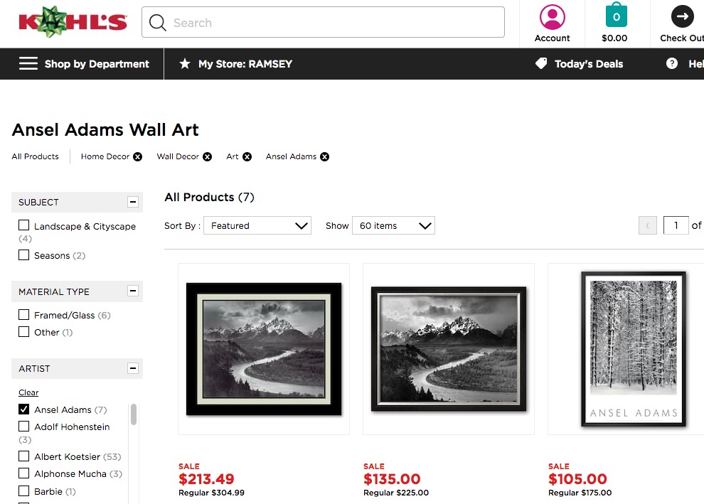


The teacher that hooked my on photography, Freeman Patterson, said that “If all 36 pictures come out, you are not trying hard enough.” A lot of stuff I see makes me think, “There are thousands of Holiday Inns and they all need artwork.”
I suppose one can look at it from the position that walls do need to be accessorized and someone needs to fill that role. Whether or not we want to put our recent graduates with $60k loans to pay fill that role remains to be seen. It leads one to question what rewards are out there for those that push the medium. With so much of photographer’s energy pulled into the social media black hole, wall accessories can seem like a welcome respite from the endless ephemera of Instagram.
Here is an ancient and very rare L.P. I had archived. (Only 4 copies in all of WorldCat!)
Famous Photographers Tell How (1958)
You can hear from the old timers what inspired them and their work.