The Well-Made Play
According to the Encyclopædia Britannica, the phenomenon that became known as “the well-made play . . . constructed according to certain strict technical principles, . . . dominated the stages of Europe and the United States for most of the 19th century and continued to exert influence into the 20th.” The EB goes on to say that “The technical formula of the well-made play, developed around 1825 by the French playwright Eugène Scribe, called for complex and highly artificial plotting, a build-up of suspense, a climactic scene in which all problems are resolved, and a happy ending.”
The term has long since become derisive, if not pejorative. Yet the well-made play survives into the 21st century not only in the theater but in film (just about every romantic comedy) and TV (just about every sitcom episode). It has its counterparts in film and TV melodramas, which draw on parallel formulae, darker in tone but no less predictable. Prose fiction writing has proved itself not immune to the lures of standardized plotting, dialogue, and characterization; think romance novels and thrillers as genres.
When I speak of the well-made photograph, then, I use that phrase not as praise but in a derogatory sense, to describe a recurrent type of photograph produced according to strict if unstated guidelines — and, beyond that, a recurrent type of photography project often (but not always) built around such pictures. I use trope similarly, in its meaning as “a common or overused theme or device: cliché.” These pictures and projects resemble each other to such an extent that, with minor adjustments, the images, their accompanying texts, sometimes even the project statements, are hot-swappable and interchangeable (as in the cases of Kelli Connell and Rick Odell, noted in the first post in this series). In short, they all look basically the same.
Déjà Vu, All Over Again
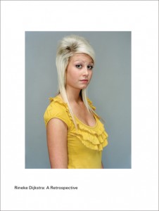
What do I mean when I say that the vast majority of contemporary work in photography looks the same? To begin with, I mean that, in a literal sense, these “well-made photographs” reiterate the same elementary formal structure:
- The primary subject (there’s rarely a secondary subject) receives central placement within the frame.
- The primary subject is the largest object within the frame.
- The primary subject is addressed frontally and head-on.
- The primary subject is closest to the picture plane within the frame.
- The primary subject is in sharpest focus.
- The primary subject contains the most intense highlights (in a b&w image) or the most intense colors, sometimes both.
Occasionally one encounters some ingenuity and invention in regard to framing, foreground-background relationships, selective depth of field, point of view, and other options, but contemporary cinematography far outstrips today’s still photography in its experimentation with such options. Even before one gets to the subject matter (not to mention the content) of the work, then, one confronts images that, from a strictly formal standpoint, got built according to a rigid and familiar template. (See, for example, this layout of the covers of recent back issues of Hotshoe International, a journal from the UK to which I contribute, and compare it to this layout of back issues of the women’s magazine Marie Claire.)
To be sure, many classic photographs (including many that I admire) employ that template (think Weston’s “Pepper No. 30”), as do many paintings and other works of graphic art. It’s a time-tested, comforting, and unimpeachable formula for the organization of visual images; the template embodies the traditions and conventions of everything from bespoke Renaissance painted portraiture to commercial-studio luggage photography for the Sears catalogue. However, once one starts to recognize this pattern, the percept becomes intrusive, and thus problematic.
They’re Everywhere
Two summers ago, at the Dali International Photography Exhibition in mainland China’s Yunnan province, I and a group of westerners had as our guide and driver a young Chinese photo student who spoke passable English. (I’d served as the festival’s international consultant for that edition; its international component consisted entirely of extracts from exhibitions I’d curated previously for See+ Art Space/Gallery in Beijing). A day into our making the rounds of the festival’s offerings, Chen, our guide, asked me what I thought of the mostly contemporary Chinese work we’d engaged with so far.
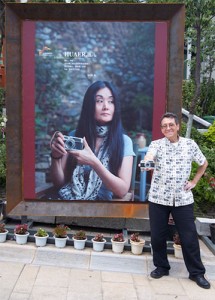
“A. D. Coleman with his Olympus Pen, in front of poster of Hua’Er holding his camera.” Dali, China, August 2010. Photo © by Joseph Fung.
I expressed to Chen the above observation, which took him aback. “What are you talking about?” he asked. “Just keep what I said in mind for the rest of the day, as we go through the shows,” I suggested, “and we can talk about it over dinner.” When we sat down later at our restaurant he looked crestfallen. “You’ve ruined it for me,” he said accusingly. “Now that pattern is all that I can see, one show after another.”
That had become my problem some time previously, so I’d cheerfully passed it along. (Misery does love company.)
•
Beyond the specifics of image construction, there’s a pervasive homogeneity of project conception that I find no less numbing, which we might call the well-made project. It manifests itself particularly, but by no means exclusively, in projects with some documentary or sociological premise. The concept gets elaborated thus:
- Identify a literal subject matter. Just about anything will do: teenagers in their bedrooms, veterans suffering from PTSD, discarded purses from your local thrift shop that you’ve frozen in blocks of ice . . .
- In their own environments or in some version of the studio, photograph 40 examples of your chosen subject matter (preferably using the image-structure template described above).
- If your subjects are human, transcribe interviews with them, or get them to write their own stories to accompany the images. If they’re animals, or inanimate objects, find apropos text fragments or create your own.
- Draft an artist’s statement explicating the significance of what you’ve chosen to point your camera at.
- Voila! C’est fait!
I outlined this also to Chen, who, after putting it to the test the next morning, appeared even more dejected at lunch. “Why do all these pictures look the same?” he asked, and “Why do all these projects have the same structure?” “School,” I answered.
Good Old Golden Mean Days
According to the bio notes accompanying these shows — some bilingual, some translated on the fly for us by Chen — almost all the photographers whose work we’d viewed had gone to school for photography, whether in mainland China, in Hong Kong, in Taiwan, or in Shanghai. (There was work on view also from elsewhere in southeast Asia — I recall a group show from Singapore — that seemed to come from the same cookie-cutter process.)
I don’t claim substantial familiarity with Asian photo education generally or Chinese photo-ed specifically, certainly nothing comparable to my knowledge of photo-ed in the west. But regardless of the varying political systems that govern them, art academies everywhere derive genetically from the original model of the French Academy, of which Albert Boime wrote in 1971, ” . . . a common-sense principle was invoked by the Academy over and over again . . . : Control instruction and you will control style.” (Emphasis in the original.) School is school.
(Rick Santorum is certifiably dumb as a post; the very thought of him occupying the Oval Office drove me to contemplate emigration. But even a stopped clock is right twice a day. Compare the required readings from any 20 randomly chosen BFA and MFA programs from the U.S., make a list of the 30 most frequently assigned texts, and tell me his claim that colleges are “indoctrination mills” has no basis.)
I do know enough about the photo-ed system in mainland China to confirm that their faculties and administrators don’t hype their programs with self-flattering claims of “challenging our habitual ways of seeing” and practicing or encouraging “transgression,” “inclusivity,” “diversity,” “difference” (not to mention differance), or the rest of the trendy blather. Nor do they immerse their students in pomo theory and jargon. Very little of what we in the west think of as the medium’s literature has received translation into Chinese. Few Chinese photo teachers speak English, few have studied in the west, and few mainland photo programs have exchange programs or other interaction with their western counterparts.
Still, like their colleagues elsewhere (indeed, everywhere), they manage to crank out grads whose projects are indistinguishable from each other and, except for the specifics of Chinese subject matter and cultural reference points, identical to work from beyond China’s borders. One can only explain the remarkable similarity between photography by academically trained picture-makers from mainland China and the work of their foreign equivalents by pointing to the underlying assembly-line educational systems that ingested, digested, and excreted them, for — much like the functional industrial structures studied typologically by the Bechers, who bear some responsibility for the phenomenon under consideration here — such pedagogical methodologies fundamentally resemble each other, minor variances aside.
(For an index of links to all posts in this series, click here.)
•
This post supported by a donation from the Estate of Lyle Bongé.






You have left out a powerful component to the enforcement of the Academy’s rules, especially on those who did not go to fine art or commercial art schools: photography centered internet forums including Flickr groups, google+ circles, and the almighty Kelby group marketing machine.
But what you really are railing against are cities and industrialization.
Not clear to me how you manage to get from my critique of cookie-cutter photographic images and projects to me “railing against . . . cities and industrialization,” both of which are fine with me. What I’m really railing against is what I explicitly say I’m railing against, and I suggest you concentrate on that rather than projecting some subtextual preference for rural/agrarian life.
Allan,
I am very much enjoying these posts which I am accessing through facebook links. Cogent…but the pain I feel as a teacher recognizing the truth of your critique is something I have long lived with. I am at the point now of trying to give students tools with which to work and then trying to allow them freedom of the road…trying…
Thanks
Paul Kohl
You can access them directly by going to the blog itself; the series starts here. And you can receive future posts automatically in your email inbox by subscribing; just enter your email address in the subscription field in the left-hand column of the page.
I’d be curious to see that list of 30 most frequently assigned texts in MFA programs. Does it look like that one: http://www.aphotostudent.com/photo-readings ?
OMG! You appear to have stumbled upon the ur-BFA/MFA reading list, the mother of all such assignments. Exactly what I was describing. Many thanks.
So what does this mean? We cannot be original anymore at all?? LOL… Schools are standardized for sure, which is why going to school for art is kind of counter-intuitive. But, art schools are supposed to be an excercise, so that you can find your own voice…. some students don’t graduate from the excercises, and continue to do the same excercises, which is why the projects become more homogenous…. I don’t agree though that the same approach will always produce the same result…. the “subject matter” matters, and the pictures of teenagers and the pictures of veterans suffering from PTSD is not the same…. if one chooses to see them as the same thing because the ‘pictures’ are the same structure, then one really doesn’t care about the subject at all, and is looking at pure aesthetics….
I have absolutely no idea what you mean when you speak of my “caring [or not] about the subject.” Whatever you intend to signify with that phrase, my “caring about the subject” of a particular photograph or photographic project — or your caring about it, or the whole world’s caring about it, or the photographer’s caring about it — does not make that image or group of images one whit better or worse as photography.
The fact is that I don’t care more about teenagers who are caregivers in their private lives than I do about expecting couples in the bedrooms in which they got pregnant. I don’t care less about veterans with PTSD than I do about widows of violence in northern Ireland. When it comes to Americans who indulge in cosplay vs. Chinese kids who indulge in cosplay, it’s a coin-toss.
The world is full of microcultures. If making 40 formally identical frontal portraits of members of such a group and sticking them in front of me demonstrates “caring,” then the guy who took my high-school yearbook photo qualifies. And if my finding any such project (or all of them) tedious suggests that I don’t “care about” the subjects, I can live with that.
The implication of your statement is that the photographer’s task is to find subject matter that people “care about,” because the resulting pictures will automatically be important. My position is that the photographer’s task is to find photographic means to persuade the viewer that whatever subject matter he or she addresses, no matter how seemingly trivial, is important.
A. D.
I’m glad you brought this up. I have (for a good while) been dissatisfied with the current work I see displayed. As a teacher, and an artist, I feel it my responsibility to explain why an image or images are displayed and hyped by museums and galleries. (“You’re an artist – explain why this is any good!”) And actually, I can’t explain it, I can’t even recommend it. I thought it was because I was getting old and crotchety perhaps, or maybe the youngsters were taking over and like the generational gap in music, I was seeing that gap in photography. And maybe that is the case.
However, here’s something that has struck me about what I’ve been seeing – words have taken over, and the visual punch of photographs have diminished. More and more, I see pix whose whole reason for existing seems to stem from the title, or from an explanation by the curator. First of all, it’s not the photographers who, by themselves, come to prominence. That work is done by people I call acculturators, curators, art historians, and critics. These people have been trained and are skilled in words. What I’ve discovered is that more and more, the photographs are visually boring, and unsatisfying, but the curator’s statement, the reviewer’s appreciation round out the package and give the picture the gravitas it needs to succeed. And who’s “art” is that? Words are the art of the article writer, or the curator. Photographers are no dummies, they see that a curator might select their pictures for an exhibit based on the image’s lack of inherent visual meaning, allowing the curator more leeway with his explanation, and so photographs become less meaningful visually.
I’m not sure this is actually the cause of the current low point in the work now selected for exhibit, but I think it’s a part. Or, maybe I’m just like the geezer banging my cane on the porch when anything new comes by. One of the two (or both).
As a teacher of undergrads in photography, I try to insist on a balance of concept and visual excitement in what my students produce. I hope I’m not leading them down the path to obscurity for doing that. Perhaps I should insist on the creation of visual boredom and heavy concept so that they can make it in the big show
Excellent desription of the general situation in Western photography education! Nevertheless, there are/were attempts to fight this dangerous uniformisation.
After blaming the schools, one coud also blame the photography “artsy” magazines that reproduce the same kind of interchangeable images produced by art school alumni, which influence current photography faculty and students who produce new same images, aso!
Certainly there are exceptions, past and present — some that I know about and, surely, some that I don’t. Alas, by my count they’re few and far between enough that they prove the rule rather than providing any serious counterbalance to this dominant trend.
As I noted in re Hotshoe International magazine, the field’s periodicals reflect this tendency. No surprise that they replicate what the museums, galleries, festivals, and book publishers prioritize; it’s an ecosystem, they’re all symbiotic (and, in some cases, parasitic).
Allan: thanks for shaking up the snow-globe! The essential impossibility of teaching innovation is a problem that has been with us for a long time.
It brings to mind Saul Steinberg’s drawing “The National Academy of the Avant Garde” in which rows of identical hippies are marching in lock step in front of a monumental academic facade. Published in 1970!
Take heart- when the general level of work starts to look homogenious, it’s is a signal that some radical new innovation is at hand. Slouching toward New York to be born!
Keep up the insightful writing!